
Last Saturday I went to a day-long celebration of the official launch of colour TV on BBC1 and ITV, which happened 50 years ago on 15 November 1969. The TV preservation organisation Kaleidoscope put together a series of screenings of early colour television material, most of it unseen since transmission, talks by special guests (including national treasure Peter Purves) and displays of historic cameras, an Outside Broadcast truck and old TV sets. The keen audience of older, mostly male enthusiasts included people who used to work in TV, especially in engineering and production roles, and we got to see gems like the first TV ad in colour (some very green Bird’s Eye peas), and a Z Cars episode, for example.

Fig. 1: The Radio Times announces the first week of BBC1 colour TV
Actually, there was another fiftieth anniversary of colour a couple of years ago, because BBC2 had introduced colour coverage of Wimbledon tennis in the summer of 1967, becoming Europe’s first colour television service. At that time, colour TV sets were very expensive and only a minority of the population lived within the range of colour transmitters, so few people actually saw colour programmes. But in December 1967, BBC2 broadcast the first colour drama serial in the UK, an adaptation of Thackeray’s 1847 novel Vanity Fair. That programme has piqued my interest especially, since I often do research into old TV dramas and old adaptations.
It seemed obvious that BBC engineers would pioneer the next technical achievement in broadcasting, and that colour would offer greater realism and visual pleasure to viewers. But production in colour was costly and complex, and colour risked appearing overly spectacular, even tawdry. Leah Panos wrote in detail about these contradictions in a CST article for our “Spaces of Television” project a few years ago. For BBC2’s Controller, David Attenborough, it was a valuable discipline to avoid being drunk with the thrills of colour, distancing BBC from when US producers swamped their dramas with gaudy period costumes when they began colour transmission across the Atlantic in the mid-1950s. The UK’s ITV companies knew that their advertisers would want to make commercials more effective by using colour, and desires and anxieties around consumerism affected how British commentators approached it. Colour had moral and nationalistic aspects as well as sensory, haptic ones.
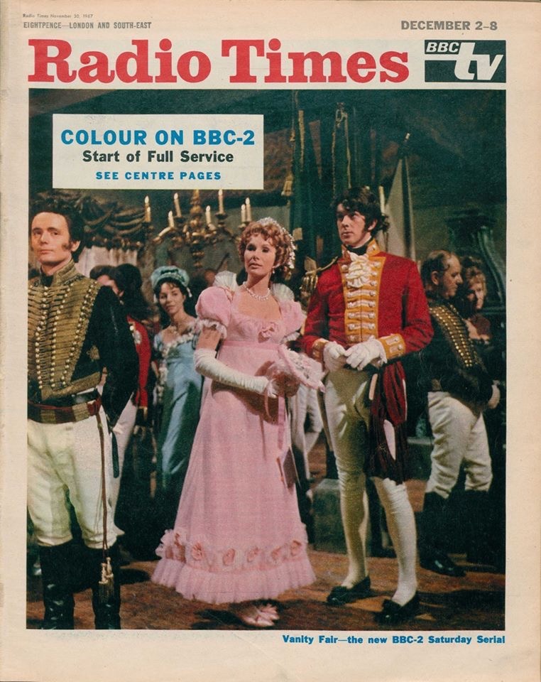
Fig. 2: Vanity Fair on BBC2 in 1967
TV colour works in relation to colour elsewhere in culture of course, and in the UK its introduction was characterised by both ostentation and restraint, as Helen Wheatley’s work on TV and spectacle, and on Vanity Fair specifically, has shown. The Vanity Fair serial followed The Forsyte Saga that had been screened earlier the same year, an acclaimed monochrome adaptation of a classic novel which shared some of same cast and crew (including Susan Hampshire in the central role). The choice of a classic novel adaptation was a conservative response to the challenge of colour, introducing this new technology via an established and “serious” genre. The novel’s period setting meant that directorial choices could foreground colour in elegant architecture, the women’s dresses and the men’s colourful uniforms, for example. The opening episode of BBC’s 1967 version featured a lengthy firework display, and much effort was put into location finding, set design, and costume, hair and makeup that would work well in colour.
The first three strip Technicolor film for cinema distribution was Becky Sharp in 1935, also a version of Vanity Fair, and the book has been the basis for several other screen adaptations. Broadcast images always need to be historicised in a complex intertextual relationship with other sources, and in the case of the BBC2 colour serial that means especially the Radio Times listings magazine, the best-selling periodical in the UK. It ran a series of full-page colour features about the making of BBC2’s Vanity Fair, with a focus on the demands and achievements of its colour. The complexity of selecting the right shades of everything from set furnishings to eyeshadow were extensively discussed and illustrated, framing the ways that the series could be viewed and orienting viewers to what colour meant.

Fig. 3: The EMI 2001 colour camera for TV studio production
BBC2’s colour transmissions had at first comprised American filmed series (e.g., the Western adventure The Virginian), travelogues (e.g., the post-imperial splendour of The Glory That Remains) and sports coverage (the Wimbledon tennis tournament), so the images of Vanity Fair were also implicitly set against how colour worked in those other genres. Physically making the programmes caused huge technical challenges, not least in using the bulky new colour cameras for the studio-shot sequences that comprised the majority of the episodes. The ADAPT project has explored some of these challenges, as John Ellis explained in a blog for CST. Scenes shot outdoors on location, with film cameras, were very difficult to match with the colours in scenes shot in a studio with multiple electronic cameras, and moreover each studio camera had to be set up to match the colour balance of the others. In Vanity Fair, colour was both a straightforward improvement in verisimilitude but also self-consciously spectacular; it was a potentially tawdry transatlantic import but was presented through specifically British programme forms and production methods.

Fig. 4: The Midlands edition of TV Times for ITV’s first week of colour in 1969
Jonathan Bignell is Professor of Television and Film at the University of Reading. His books include three editions of An Introduction to Television Studies, A European Television History (edited with Andreas Fickers), two editions of British Television Drama: Past, Present and Future (edited with Stephen Lacey), Beckett on Screen and Postmodern Media Culture. His articles about television include contributions to Adaptation, Critical Studies in Television, the Historical Journal of Film, Radio and Television, Media History and Screen. This blog relies on research conducted by Leah Panos for the AHRC funded “Spaces of Television” project at the University of Reading.

It was a brilliant event wasn’t it Jonathan? I wish that I’d not felt so wiped out even I arrived, because then my wife and I would have been able to have stayed and enjoyed the day fully. But I was struggling, so I only managed about six hours or so…. which was a pain because I was *really* looking forward to the “Z Cars” episode in particular. And all I really ended up doing was wanting to get home to rest and get more pain-killers. But a *wonderful* line-up of stuff. These events really take it out of me these days, but it’s a joy to be able to get along even for a short while.
All the best
Andrew