
As part of my ongoing research into uses of ‘blue screen’ and the role of the television designer in ‘Golden Age’ television drama, I want to blog about an episode of a little-known ITV anthology series of the mid 1970s, Shades of Greene (Thames Television, 1975, 1976), which adopted this technique extensively over two series of televised Graham Greene short stories. The drama went out on Tuesday nights at 9pm, mostly as individual plays of 50 minutes, and occasionally two shorter stories within one episode.

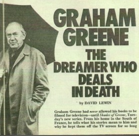
It was the first time Greene had allowed his works to appear on television, having previously been reluctant to relinquish control over them for the relatively small financial reward that TV offered in return. In a TV Times feature he explained how he had been impressed by Thames’ series The Rivals of Sherlock Holmes (1971, 1973), and when his brother Hugh (former Director General of the BBC) offered to act as story consultant on Shades of Greene and keep him informed of what was being planned, he agreed to the project.
As an accompaniment to my article in CST’s forthcoming Autumn 2013 journal issue on Special FX, which explores blue screen (or ‘Colour Separation Overlay’ (CSO) as the BBC referred to it) in BBC single plays of the 1970s and early 80s, here I want to analyse one episode of this interesting contemporaneous experimental series, When Greek Meets Greek (TX: 9/9/75) that used the same procedure, which ITV called ‘Chromakey.’ Both the BBC and ITV systems worked through the same principle of electronic colour switching, where the presence of a selected hue (normally a strong blue or green) triggered those areas of the picture to be switched for another image, captured on a second camera, enabling composite images to be created. Chromakey was used in some respect in most television genres including current affairs, light entertainment, comedy and children’s drama.
As a video-based technique prone to visible errors such as fuzziness around soft edges and strobing of fast moving objects, Chromakey generally looks dated to the modern eye, and indeed, its inclusion in a programme generally locates it in the period from the early 1970s to the mid 80s – the relatively short life of this effect in its original analogue form. However, Chromakey’s imperfections are also part of its ‘charm’, a testament to a less cautious era of television production that allowed an element of what John Caughie (Television Drama: Realism, Modernism and British Culture, Oxford: Oxford University Press, 2000: 55) has described as ‘something of the “wizard prang”’ into prestigious productions. The mistakes of this difficult-to-master procedure are also more than compensated for by the intelligent and daring uses to which it was frequently put.
The institutional culture of broadcasting in the 1970s allowed scope for innovation and risk-taking in production design and direction, as Thames Television designer, Peter le Page, who worked extensively with Chromakey during the 1970s and who, along with David Marshall was principal designer on Shades of Greene, has testified:
‘I suppose we believed we knew the way the programme should be made and that we were somewhat too young, arrogant, naïve and inexperienced to recognise the impossible when we saw it, but foolish enough to make the attempt. It is surprising with hindsight how often we succeeded. Working as a designer was a continuation of the freedom to experiment enjoyed while at college. We were actively encouraged to try new and different design solutions providing the requirements of the script, deadlines and budgetary constraints were met.’
In an unpublished booklet, (A Short History of ‘Those Pictures With the Blue Line Round Them That Take Forever To Line Up!’: A Designer’s View of Television Matting, ABC/Thames 1963 to 1992) Le Page cites Shades of Greene as the first Thames drama production to extensively use Chromakey as a ‘way to realise the requirements of the material’. He and producer Alan Cooke exchanged ideas for 18 months prior to production, to ‘find a direction and style for the production’. Le Page remembers:
‘The basic premise was that this would not be a straightforward, linear adaptation… The stories themselves had a certain edginess we wanted to communicate to the audience […] We thought that using sets with forced perspectives, matting, and unusual camera angles and lenses might achieve this effect.’
A briefing document that Cooke produced and circulated around the production team, vividly conveys how he believed Greene’s writing, could best be realised via Chromakey:
‘Suppose instead of laboriously constructing a whole setting from a single phrase we focus on the image itself […] Would we not free forces mental as well as material with which to juxtapose image against image, action upon picture, time beside time? […] We believe we can expend our forces better than by building backgrounds that do not inform, or film movements that are predictable and trite. Film and theatre have established their own shorthand; so have the Graham Greene stories. Why should we not (while borrowing from all three) find a vital graphic form of our own?’
With its rather inflated language (‘’Would we not…’) and polemical tone, Cooke’s team statement reads strikingly like a manifesto for a new approach to televisual style, on a par with Troy Kennedy Martin’s famous 1964 Encore rally against naturalism, ‘Nats Go Home’.
Reflecting the multiple technologies of the era, Shades of Greene was a hybrid of 16mm film, studio recording, and Outside Broadcast video, although film and video were never combined in the same episode. Chromakey was not used in every video recorded story, as contributing directors were allowed to approach the material as they wished, whilst being encouraged to follow a style outlined by Cooke which drew on sources from the period between 1935 and 1956 (King George V’s Jubilee and the Suez fiasco) when most of Greene’s stories were set.
Opening title sequence
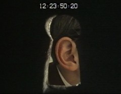
Although Chromakey was not used consistently across the whole series, the drama’s opening title sequence (by Ruth Bribram) alludes to the layering of graphic elements and backdrops and plays with the idea of pictures set within pictures.

The inclusion of an animated hand pulling back the image, and a sequence in which the frame becomes a smaller picture held against a larger, identical image both suggest the role of the designer, composing the picture that we see.
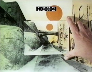
The smaller image is removed, and in its place, set within the larger landscape is the opening frame of the episode, which we zoom in on as the story begins.

Instead of foregrounding the stories’ literary source, the title sequence therefore is based around representations of space, image and frame.
Greeneland
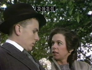
The first episode of series 1, When Greek Meets Greek, establishes several aspects of the series’ style and tone, and its patterns of Chromakey use. In the story, a chemist, Nicholas Fennick (Paul Schofield), sets up a fake Oxford college and is delighted when ‘Lord Driver’ (Roy Kinnear), a phoney aristocrat, enrolls his ‘soldier’ son, Frederick (Terence Budd) who is actually fresh out of borstal.

Eventually Frederick and Fennick’s niece, Elisabeth, (Annette Robertson) own up to their hoaxes, and together decide to con their elders out of their savings and set up a grander scam without them.
The veneer of fakeness that the Chromakey backdrops lend the production is well suited to both the story’s theme of conmen contriving to make things appear other than they really are, and to the general quality of ‘strangeness’ of Greene’s milieux. Cedric Watts (A Preface to Greene, London: Longman, 1996: 144) has observed that ‘Greene’s descriptive emphasis on blighted landscapes as the setting for blighted lives gave a distinctive and even parody-inviting character to his works’ and the physical appearance and performance style of When Greek Meets Greek’s protagonists is subtly comedic and larger than life, an approach which works well with the ‘unreal’ Chromakey backdrops. The BBC CSO plays share this quality of inflated performance, suggesting that Chromakey was considered more suitable for heightened rather than flatly naturalistic productions, for obvious reasons.
Coined in 1940, the term ‘Greeneland’ was later defined in the Supplement to the Oxford English Dictionary, as a word describing ‘the world of depressed seediness reputedly typical of the setting and characters of the novels of Graham Greene’. This is the quality that le Page alluded to above when describing the stories’ ‘edginess’, which another critic (Samuel Hynes, Graham Greene: A Collection of Critical Essays, Englewood Cliffs: Prentice-Hall, 1973: 6) has called ‘highly charged drabness’.
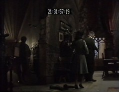
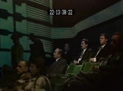
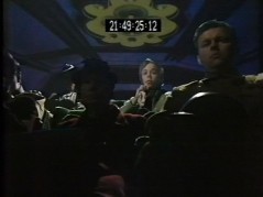
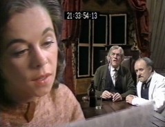
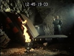
Chromakey images are used in When Greek Meets Greek’s construction of a wartime world of dodgy dealings and rationing that is both edgy and drab. Shadowy, noirish corridors, and shabby rooms shot from oblique angles are recurring spaces, such as these interiors representing Fennick’s and Driver’s homes.
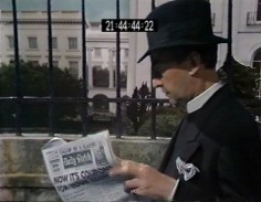
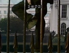
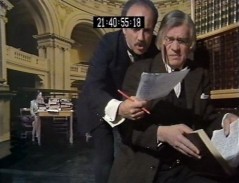
A Chromakey sequence of the arrival of Rev. Simon Milan (Frank Thornton) who fraudulently writes Frederick’s exam papers, is also suggestively seedy. The reverend approaches the railing, then pauses to check the bottom of his shoe before descending some steps in the foreground, representing his descent into low life dealings. The low camera angle and restricted view through the iron railing are consistent with the series’ overall strategy of presenting unsettling visual perspectives.
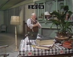
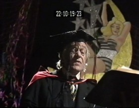
In a scene recorded on a studio set without Chromakey, Frederick’s hoax graduation ceremony is set in a tacky hotel suite, vulgar décor and tawdry mass culture further features of Greeneland.
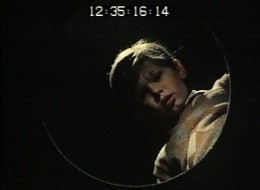
A dialectic of harshness and sentimentality, also typical of Greeneland, is presented when, in contradiction with her cool, calculated approach to illicit business, Elisabeth reveals her softer side by weeping at a film. Chromakey backdrops form the decor and architecture of wartime picture houses, and the especially stylised exterior cinema shot, with its image of Bogart, resembles photo-collages of the era. The graphic design elements incorporated in the images enable the drama to powerfully evoke the visual forms of the interwar/wartime era and create a ‘structure of feeling’ through the juxtaposition of images that Cooke was aiming for. Chromakey’s ‘unreal’ quality is appropriate for the representation of the fantasy world of the movies which Elisabeth loses herself in.
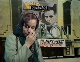
The ‘cut out’ quality of such images resembles the flatness of the portraits on contemporaneous magazine covers and indeed Cooke had specifically mentioned ‘the illustrated magazines of the time (from the mid-1930s to the mid-1950s) and the photographs of Bill Brandt’ as visual reference points for Shades of Greene’s style.
The distorted perspectives and distinct separation of foreground and background planes in Brandts photos are visual characteristics that run through the series. For example these composite images of the library and of Elisabeth inside Fennick’s house feature similar surreal perspectives with a clear emphasis on the disjunction between a figure in the foreground and their backdrop.
Peter le Page contextualizes the use of this effect within television’s technological changes. The introduction of colour and 625 line definition on ITV in 1969 resulted in a greatly improved picture quality. The trade off, however, was heavier colour cameras with restricted mobility and limited focusing capacity due to their fixed zoom lenses, which produced either too great or too shallow a depth of field in a shot. Le Page asserts:
‘Chromakey was used in the stories to give the option of changing the scale and lens angle of the background (BG) of the shot, compared to the foreground (FG) cameras lens angle. This would produce an apparent wider lens angle near the actors, creating a more intimate feel using Chromakey composites. By separating the FG from the BG it was possible to exploit the particular visual qualities between an image that was on a relatively narrow FG lens angle and a BG image that was on a very wide angle lens’.
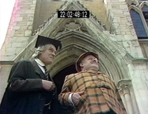
Within the play, some stylistic consistency is retained across scenes using real locations, notably those of Fennick and Elisabeth showing Lord Driver around the fake ‘St Ambrose College’, which was recorded on OB at Greene’s old Oxford college, Balliol. This is achieved with the use of oblique angles and perspectival tricks as, for example, in this shot of Fennick and Lord Driver against a door, which, with its low angle and static frontality could be mistaken for a Chromakey image.
Odd camera angles, distorted perspectives, and unusually juxtaposed figures and objects are coherent stylistic aspects that run across the anthology to a certain extent, as these shots from Under The Garden, shot entirely on 16mm, illustrate.
Although Chromakey was destined to disappear with the passing of television’s analogue age, its relatively brief ‘moment’ contains some intriguing examples of television design. Shades of Greene was an ideal series for experimentation with the technique, the method proving highly effective for evoking the strangeness of Greeneland through surreal juxtapositions and effects.
Dr Leah Panos is a Post-Doctoral Researcher on the Spaces of Television project based at the University of Reading. Recent case studies for the project include work on the use of the Steadicam in Brookside, the television plays of Howard Schuman, aesthetics in the TV studio musical Rock Follies, and the role of the designer in 1970s dramas using Colour Separation Overlay.


Is “Shades of Greene” available to buy on DVD ?