According to the most recent iPlayer monthly performance pack (April-June 2016) – a periodical report by the BBC that examines iPlayer usage – the online service fulfilled 290 million programme requests in June 2016 alone. As the report goes on to reveal, this figure, which is impressive in and of itself, was significantly higher during the colder months, with viewing peaking at 352 million requests in January of 2015 (if/when the next study is published, this figure is likely to be higher still). Over the most recent twelve months covered by the report, the iPlayer received and fulfilled a staggering 3.26 billion different programme requests. That’s a lot of television.
With so many user interactions, the iPlayer provides the BBC with opportunity to harvest and analyse a wide range of different data types (location of user, date, time, device, operating system, content selected, etc.). Once gathered, this data can be used to evaluate the service, develop new audience insights, and even support commissioning and scheduling decisions. However, the raw data itself requires significant treatment before it can offer any useful insights. Indeed, due to the volume, variety and velocity (Laney, 2001) of this information, it has become necessary to develop quick and efficient ways to make sense of the data. Data visualization – the process of converting this raw information into visual insights – is the solution to this problem.
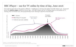
An extract of the latest iPlayer monthly performance pack. This particular data visualization shows the average daily usage of the iPlayer for June 2016
The iPlayer performance packs are an interesting and somewhat unusual example of data visualization as they are audience facing – though, given the public service status of the BBC, their widespread availability should come as little surprise. Typically, however, data visualization tends to happen behind closed doors yet plays an increasingly important role in contemporary television culture. In the case of services such as Netflix, data and data visualization are utilized for a range of different activities: to track the health of its service and pre-empt any outages, to search for patterns in viewer behaviours and preferences that might make the service more effective or more profitable, etc. Thus data visualization plays a significant but often invisible role in a range of different areas and activities within the television industry (and various other industries for that matter), from the point of conception all the way through to delivery and reception.
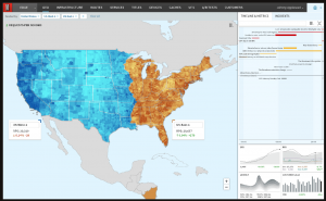
A map of Netflix usage in the US that measures requests per second. Note how usage differs significantly depending on time zone.
Data visualization has therefore become an integral strategy and much sought after skillset within the television industry. As scholars, however, we tend to have very limited access to the raw data that is used to drive and evaluate these services, to generate audience insights and/or guide commissioning and scheduling decisions – and often even less access to the skills or tools required to work with this information. Even in the case of public service reports such as the iPlayer packs, we are reliant upon what Stefan Baack has described as ‘interpretive monopolies’ (2015) – namely, reports or visualizations that have already been filtered through specific institutional lenses. Thus, if we want to explore the growing body of data that surrounds and shapes the television industry today, we need to do this on our own terms, and preferably with access to the raw data itself.
Fortunately, in the process of researching the role of data within the creative industries, I’ve come to discover that there is actually an abundance of data (and free visualization tools[1]Tableau appears to be the industry standard. There’s a free public version, but academics/students/administrative staff can apply for a free license to use the more versatile desktop version. ) that we as scholars can easily access and explore. In the remainder of this post I want to identify a number of these key data sources before sharing some examples of how this information can be incorporated into our research (and into our teaching!)
Broadly speaking, there are two main ways that we can find television related data. Firstly, the easy way: raw data that is nicely packaged and available to download in formats that are compatible with data visualization tools. Though there is a relatively limited amount of this kind of data out there, there are some important sources worth noting. Ofcom, for instance, publishes the raw data used in their various reports, in mostly accessible formats (such as .csv or .xls files). Another useful resource is IMDb, the underlying data of which is available to download here (though there are quite a number of restrictions on how this information can be used). It’s also worth mentioning the Television and Radio Index for Learning and Teaching [TRILT] compiled by the BUFVC which features UK television and radio listings all the way back to 1923 – and which, most importantly, can be exported in a compatible format (with each listing featuring a range of data categories such as programme title, episode title, synopsis, and a list of creative personnel).[2]TRILT does require a subscription, however.
The second and more difficult method of acquiring data is by “scraping” or “mining” it ourselves. This is usually much more labour intensive and requires an entirely new skillset. Even if we can overcome these initial hurdles, there are various issues to do with copyright that can limit our access or use of this data (many websites explicitly prohibit scraping in their terms of use). However, it can be worth the additional effort as “original data” opens up a much wider range of scholarly opportunities. For example, over the last couple of months I’ve been performing a daily “scrape” of the BBC iPlayer, slowly building up a database (including date, channel, genre, programme title, programme duration, interface position, etc.) so that, at the time of writing I have somewhere in the region of 40,000 different pieces of data. By my estimate, I’ll have approximately 200,000 bits of information after a year of scraping. [3]It’s worth noting that many websites can be scraped if we simply add a relevant extension to the URL (e.g. .json or .rdf). For instance, when viewing the BBC page for the first episode of the new … Continue reading
But what can we do with this data once we have it? What is its scholarly and/or pedagogical value? The short answer: we can do almost anything. The long answer: we can ask (and answer) questions that we’ve never been able to ask before. For instance, with data taken from IMDb or TRILT, we can conduct large scale analyses of television programming trends (note, in comparison to my paltry 40,000 pieces of iPlayer data, a typical IMDb spreadsheet, of which there are numerous, contains several million pieces of relational data). In doing so, we might ask: what television genre was most prevalent during a specific user-defined period of time such as the 1960s? How does the popularity of a certain genre (or genres) differ from country to country or network to network (or both)? How common is the practice of programme repetition at various points in history, and/or in relation to specific genres or channels? At one time, it would have been difficult if not impossible to answer these questions, but as television-related data continues to proliferate, it becomes increasingly possible to do so.
It’s also worth pointing out that we don’t have to come to the data armed with a series of questions. Instead, we can let the data speak for itself, to reveal to us patterns or insights that we would never have even considered to search for in the first place.
So far, this may all sound rather abstract, so I’d like to finish with a couple of concrete examples that illustrate how I’ve personally begun to incorporate data and data visualization into my own research (and to a lesser extent, into my teaching).
Several months ago I binge watched the sixth season of The Walking Dead [TWD] in the space of a couple of weeks. As is often the case when we consume television in such a compressed manner, we notice narrative details or formal patterns that might not be apparent through more traditional, weekly viewings. For instance, in my bingeing of TWD I noticed a pattern of storytelling in which the narrative seemed to oscillate between macro- and microcosmic episodes – i.e. episodes that featured a large number of characters and narrative threads (the macrocosmic) and those that told smaller, more intimate stories (the microcosmic).
In order to explore this further, I decided to take a different approach. Rather than re-watching the series all over again, I compiled a dataset (combining data from IMDb and walkingdead.wikia.com) and began to search for trends (and anomalies) in narrative form across the first six seasons. In methodological terms, this was done by mapping the series out according to the number of appearances by “main” characters (i.e. those with at least 15 credits across the first six seasons – thereby reducing the possibility that incidental credits or minor roles might skew the results.) Although this was somewhat of a crude strategy as it is based on the assumption that a higher number of characters per episode indicates a greater number of narrative threads, it did confirm my initial observation that the series had begun to adopt this macro/microcosmic approach. Furthermore, as the visualization below (hopefully) demonstrates, this appears to be a relatively consistent pattern – particularly from the third season onwards, when AMC decided to expand the season duration to 16 episodes and include mid-season breaks (a la network television). Clearly, there’s a correlation here in which the number of narrative threads (or character appearances) fluctuates more widely as the series is stretched out and must cope with the added production demands. The regular and frequent use of episodes that feature a smaller cast and fewer narrative threads thus provides relief and flexibility in response to these wider industrial pressures.
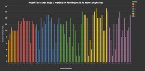
Number of appearances by “main characters” across the first six seasons of The Walking Dead. You can see a different, interactive version of this viz here.
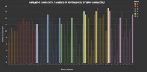
Bonus analysis: note that season premieres, mid-season finales, and season finales all tend to feature a higher number of “main characters”
This analysis of narrative patterns in TWD is a relatively simplistic example of incorporating data within television scholarship but it is really just a starting point. For instance, we can scale-up this analysis, compiling larger datasets in order to explore much broader trends over a range of programmes, genres, or periods in television history – a model of research that Lev Manovich describes as “cultural analytics” (2009). We can also use this data to identify trends or patterns which we can then explore through more “conventional” qualitative research methods. Datasets are also inherently versatile so that you often end up exploring entirely different or unexpected aspects than those you had set out to study. Indeed, I found that I was able to examine a range of other issues using the TWD dataset, such as correlations between episode ratings and character deaths (turns out there is a positive correlation!) or the balance of gender as in the following data visualization:
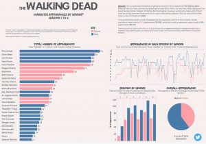
An analysis of character appearances in the first six seasons of TWD according to gender. You can view the full interactive version of this viz here.
Though I’m very early on in the process of working with data, and while I’m still learning the mechanics and best practices, it clearly has a great deal of scholarly potential. But data analysis and visualization has real pedagogical value too. Alongside all those chapters, essays and articles that we love to set our students, data and data visualizations offers a more visual but equally insightful way to study television (or any other subject). Students may also feel more invested or empowered if they are able to search for and discover their own original insights in the data. And of course, it doesn’t hurt if they develop a new skillset along the way, one that is increasingly desirable and commonplace within the industry itself.
JP Kelly is a lecturer in film and television at Royal Holloway, University of London. He has published work on the emerging economies of online TV in Ephemeral Media (BFI, 2011) and on television seriality in Time in Television Narrative (Mississippi University Press, 2012). His current research explores a number of interrelated issues including the development of narrative form in television, issues around digital memory and digital preservation, and the relationship between TV and “big data”.
Works Cited:
Baack, Stefan (2015) ‘Datafication and empowerment: How the open data movement re-articulates notions of democracy, participation, and journalism’. Big Data and Society. July-December: pp. 1-11.
Laney, Doug (2001) ‘3D Data Management: Controlling Data Volume, Velocity, and Variety’. Report, Gartner, USA, February. Available at: http://blogs.gartner.com/doug-laney/files/2012/01/ad949-3D-Data-Management-Controlling-Data-Volume-Velocity-and-Variety.pdf (accessed 15 Jan 2017).
Manovich, Lev (2009) ‘Cultural Analytics: Visualizing Cultural Patterns in the Era of “More Media”’. Manovich.net. Available at: http://manovich.net/index.php/projects/cultural-analytics-visualizing-cultural-patterns (accessed 15th Jan 2017).
References
| ↑1 | Tableau appears to be the industry standard. There’s a free public version, but academics/students/administrative staff can apply for a free license to use the more versatile desktop version. |
|---|---|
| ↑2 | TRILT does require a subscription, however. |
| ↑3 | It’s worth noting that many websites can be scraped if we simply add a relevant extension to the URL (e.g. .json or .rdf). For instance, when viewing the BBC page for the first episode of the new Sherlock series, we can automatically scrape a range of data about the programme such as genre, short synopsis, long synopsis, original transmission date and time, duration, and availability of audio description. For anyone interested to see how the data looks in its raw form, you can access it here: http://www.bbc.co.uk/programmes/b0881dgp.json |


