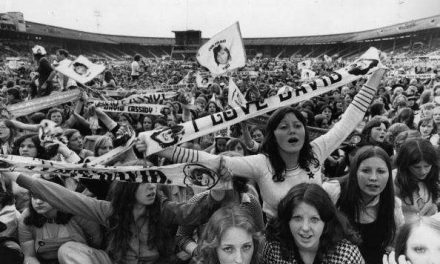
On a Good Day… there’s a knock at the door and it’s the postal operative with a ‘Do Not Bend’ envelope that they don’t want to bend and you open it up and inside you see this…
Fig 1: Adam Adamant Lives! (2|entertain: 2006)
… and you are so relieved because you were so worried about what 2|entertain were going to do to the viewing notes you’d written for their DVD release of Adam Adamant Lives! (1966-1967). The series – a satirical caper show contrasting Edwardian and Swinging Sixties perspectives – concerned a gentleman adventurer who had been frozen in a block of ice in 1902 and was then revived in the culture-clash of 1966. As such, I had visions of a rather nicely photographed monochrome series being depicted in rather garish and lurid colours akin to the imagery and design of the successful Austin Powers film series.
But where I had got very lucky was that the designer working on this was Clayton Hickman. Clayton’s an amazingly talented man; he writes articles and scripts, he edits magazines and comics, and he’s an absolute design genius who can untangle warped images and turn the monochrome into polychroma. Okay, so there’s a lot of design genii about… but he’s one of those very best of design genii who can not only make something look good on the page, but also understands the feeling and style of the subject matter.
Look at what Clayton’s done here. It’s perfect. In fact, it was the very publicity shot that I’d hoped somebody would use. Not any of the colour shots taken on set – and, yes, I admit, they’re very pretty – but at a time when it was perceived that monochrome wouldn’t sell, he had selected the key image of Adam – cape billowing, sword-stick at the ready – and combined it with the correct series logo and typography to give a stark, classy black and white image (with just a hint of pink filigree as a concession to the colour spectrum). Around the same time, I’d seen the DVD set of The Audrey Hepburn Collection where a stylish black and white snap from Breakfast at Tiffany’s (1961) had graced the box and, secretly, I’d hoped for something similar… and here was Clayton giving me that to perfection … without me even asking.
Writing words about television shows is great – it may not be one of life’s essentials, but it’s a lot of fun. But what’s even more fun is when the words are packaged by somebody who offers not only talent and skill but blends it all with innate understanding.
On a Good Day… the e-mail pings and it’s from designer-letterer-editor Peri Godbold. I’ve had the delight of working with Peri now for just over 30 years. She’s possibly looked after more of my work on Doctor Who Magazine than anyone else and I can’t think of a single moment when it’s ever sunk below the level of Brilliant. Again, she’s somebody who takes the time to understand whatever it is we’re tackling and writing about – so it’s not just the layout and her amazing understanding of colouring, it’s the attention to detail and its sympathy with the show in question.
From 2005, Peri designed a series of Doctor Who Magazine Special Editions in which we chronicled the day-by-day production of each episode of a recent series. And these took the word ‘lavish’ to a whole new level. I mean, just look at this…
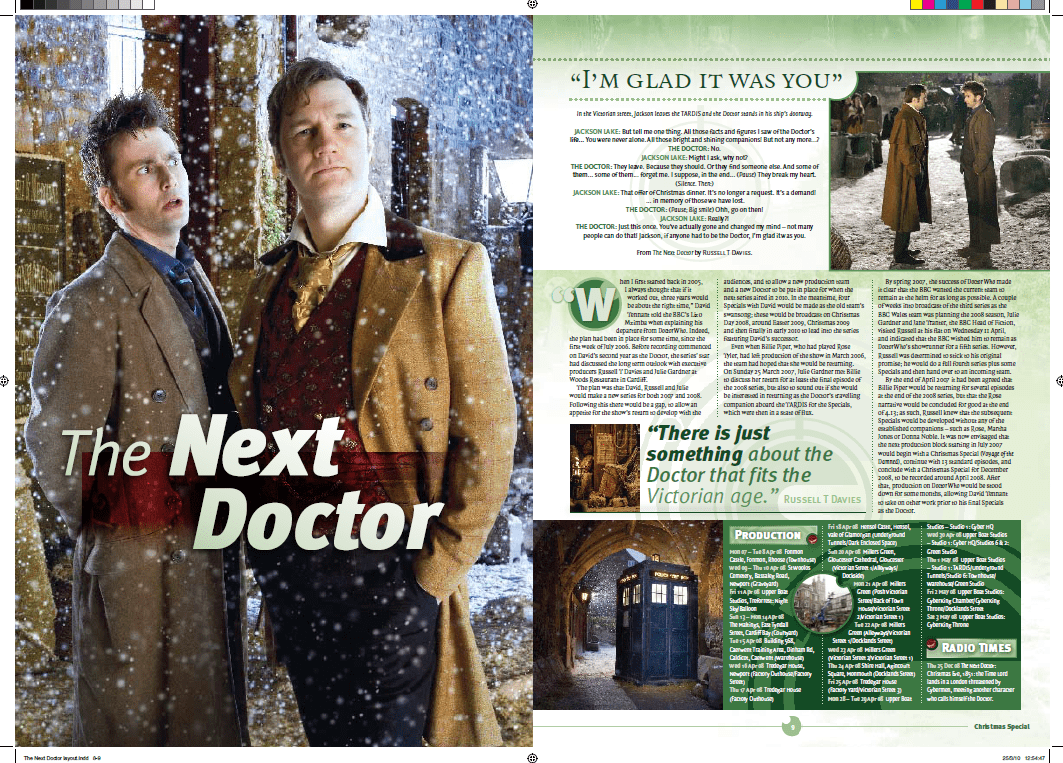
Fig 2: Doctor Who Magazine Special Edition #25: The Doctor Who Companion – The Specials (Panini: 2010)
This is the opening spread to the 2008 Doctor Who (1963-1989,1996,2005-) Christmas Special. Not only does Peri know precisely the right narrative photo to choose as her dominant image – the real Doctor actor in astonishment to the other Doctor whom he’s suddenly encountered in a snowy Victorian London – but the key script quote and production schedule box-outs are clearly designed, an effective colour coding for this instalment presents the whole entry in luscious shades of fern, olive and moss, and even the inset images and watermark are riffing off the Gallifreyan alphabet used by the Doctor’s race. And she does 100 pages of that! Isn’t that amazing?
On a Good Day… you get an attachment from Mike Jones who’s working on the Doctor Who Chronicles bookazine series. And, before you think ‘Oh, more Doctor Who’, well, what Mike’s been working on is the On the Box feature in which we take a specific year of British television and contextualise Doctor Who within it. Which means, because Mike’s so clever, you get this…
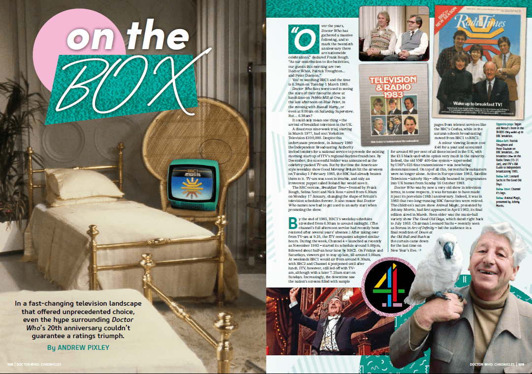
Fig 3: Doctor Who Chronicles: 1983 (Panini: 2021)
So, this isn’t just about Doctor Who… it’s about a whole heap of stuff and soaking up the feeling and milieu of the year in question – in this case 1983. Now, fortunately, Mike’s one of those people who gets television and isn’t just across Doctor Who… he’s designed other publications and soundtracks connected with the worlds of Gerry and Sylvia Anderson, and last year he had a notable success with Lovely Jubbly: A Celebration of 40 Years of Only Fools and Horses (Penguin: 2021) which he designed and co-authored. As such, he’s knowledgeable enough to think outside the box, to use that studio design photo with a period TV set to create the opening image, to seek out period publications and logos from the year’s publications, to get the relevant screen grabs from Breakfast Time (1983-1989), select appropriate title typefaces and assemble a pungent presentation of this pastel period.
Another Good Day… is when Chris Bentley – the poor man who’s taken on the job of designing the worst book ever written about The Avengers (1961-1969) and really deserves better – reveals that he’s come up with a piece of design for the cover that almost makes the 352 pages of terrible awfulness behind it consumable. Chris is another writer-designer-researcher who just gets all this sub-culture and sense of what’s right and what’s wrong… so he comes up with this…
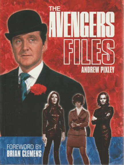
Fig 4: The Avengers Files (Reynolds & Hearn: 2004)
… terrific assembly of Patrick Macnee as iconic British agent John Steed – plus striking images of three of his most memorable colleagues – with the impeccably selected shots all offset sumptuously against the blazing, exciting reds and scarlets of Steed’s inimitable carnation. Perfect! You can see why Chris is ideal to curate a range of visually stunning ‘Vault’ books like the forthcoming one on Space: 1999 (1975-1977) from Signum Books.
A Good Day… can also be Richard Atkinson, another versatile writer-editor-designer, sharing with me his opening spread for a piece on the BBC2 adaptation of The Hitch Hikers Guide to the Galaxy (1981) destined for Bauer Media’s TV Years. A massively eye-catching pair of pages…
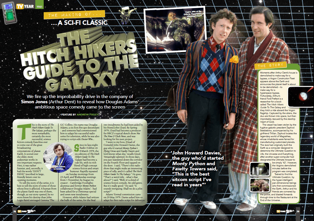
Fig 5: TV Years Issue 5 (Bauer: 2019)
… which not only blend the expected elements of original logo and key photographic elements, but even weaves the look of the serial’s award-winning animation into the fabric of the piece… giving a unique feel while also remaining true to the magazine’s standard design format. Genius!
On a Good Day… Rob White from Network Distributing sends you the design for the viewing notes that will be going in with the Blu-ray release of The Professionals (1977-1983), and, again, you know that it’s all in safe hands because, as you can see…
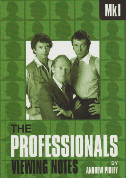
Fig 6: The Professionals MkI (Network: 2014)
… not only has he picked a great shot of the three leads and the logo and typefaces are bang on, but he’s taken the colour and silhouette images of the opening titles and closing credits and used them as the structure for the whole affair. Nice one Rob – couldn’t ask for more!
And on many of the Good Days of late… it’s been an e-mail from Martin Cater, another designer at Network, who is one of those people that just lives and breathes popular culture – music, literature, comics, television and so on. So you know that he’s also going to be thinking of how he can combine and adapt something that’s aesthetically right for the product.
Take the Gerry and Sylvia Anderson Supermarionation space series Fireball XL5 (1962-1963). Martin immediately thinks of how he followed the adventures of Colonel Steve Zodiac and Venus in the pages of the comic TV Century 21 (1965-1971… more or less) where the strip stories were promoted via ersatz headlines on a tabloid-style front page. Thus, we get this…
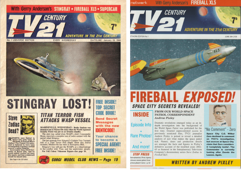
Fig 7: TV Century 21 No 1 Universe Edition (City Magazines: 1965)/Fireball XL5 (Network: 2009)
Or Shoestring (1979-1980), a filmed series about a private investigator working for a fictional local radio station called Radio West which once graced the cover of the BBC listings magazine Radio Times (1923-). Isn’t that just perfect for Martin to suggest that he does this?

Fig 8: Radio Times (4-10 October 1980)/Private Ear – The Shoestring Story (Network: 2017)
Or the comedy The Goodies (1970-1982) which is so dear to me, where we’ve split the text into two volumes – an overview and an episode guide – and where Martin has been inspired by two of the gift books put out by the team in the 1970s, meaning that he’s suggesting these:

Fig 9a: The Goodies File (Weidenfeld and Nicolson: 1974)/The Goodies DVD File (Network: 2018)

Fig 9b: The Goodies’ Book of Criminal Records (Weidenfeld and Nicolson: 1975)/ The Goodies’ Book of Criminal Recordings (Network: 2018)
And it’s not just the outsides, it’s the insides too. With the Blu-ray release of Maigret (1960-1963,1969), Martin has clear images of the atmospheric closing credit captions depicting Le Patron and his faithful colleague Lucas, which means that he can offer these:
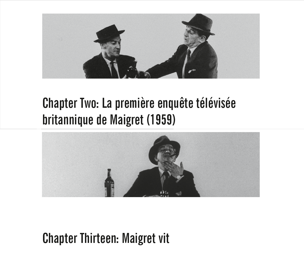
Fig 10: Maigret, Simenon and the Corporation (Network: 2021)
Or when it comes to Stingray (1964-1965) and I’ve employed quotes from episodes to introduce each chapter, Martin’s knowledge of the show means that he can pinpoint the dialogue from the episodes and – with access to the Blu-ray transfers – can grab the relevant moment, assemble them with the right typeface, and create things like this…
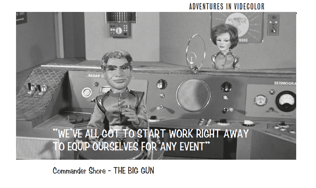
Fig 11: Stingray: Adventures in Videcolor (Network: 2022)
Knowing that you can collaborate with designers like this who have such understanding in addition to expertise is one of the massive pleasures of doing all this writing – and one that I appreciate immensely.
And on a Bad Day – and the Bad Day will come – when there’s a knock at the door and it’s a representative of society who informs me that I’ve been existing in contravention of the Meaningful and Useful Lives Act 1965, then I’ll be able to say: “Okay, it’s a fair cop. Society doesn’t really need to know what piece of music is playing in the nightclub where Georgina Jones works or what days Doctor Who was recording in Gloucester or what the trade magazines of the day made of the BBC’s attempt to crack the US networks with some rather nice Georges Simenon adaptations.
“But, you know what, I got to work with some great people and they kind of made it all look rather lovely, didn’t they?”

Fig 12: Maigret, Simenon and the Corporation (Network: 2021)
_______________
Andrew Pixley is a retired data developer. For the last 30 years he’s written about almost anything to do with television if people will pay him – and occasionally when they won’t. Hey – do you remember those three Naked City (1958-1963) paperbacks that he was after two years ago? Well, he was recently able to get all three at very reasonable prices from David Sheard of the Not In Heckmondwike Book Shop, so, y’know, maybe if there’s some items you’re still after for your own collection, it’s maybe worth checking out his current stock…