
Several weeks ago I came across an interesting piece in The Guardian featuring the work of Jason Shulman, a photographer who condenses entire films into a single image by shooting them in one ultra-long exposure. By using this technique Shulman produces haunting images of these films that could quite easily be mistaken for some of the later, more abstract paintings of William Turner. Their obvious aesthetic merit aside, Shulman maintains that the images are actually very revealing of the films that they document. As he explains: ‘You can learn something about the director’s style from this kind of kooky translation: you can learn that Hitchcock deals with people’ whilst ‘Kubrick deals with composition’ (Shulman, 2017)
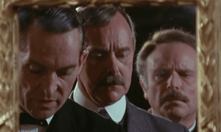
He’s not wrong. There is a notable stylistic difference between the films that Shulman has photographed. Some, such as Dr. Strangelove (see below) and The Texas Chainsaw Massacre, even contain recognisable elements. ‘Each of these photographs’, Shulman maintains, ‘is the genetic code of a film – its visual DNA’ (2017).

Fig 1. Dr. Strangelove condensed into one image. Image copyright of Jason Shulman.
Being a television scholar, I naturally began to wonder what my favourite TV shows might look like if they were photographed in this way. What is the genetic code of House of Cards? What does the visual DNA of Mad Men look like? And perhaps most importantly, does this process have any critical value? Does it tell us anything interesting about these programmes that we cannot learn through other means?
Shulman’s work could be considered an example of “deformative criticism” – a model of analysis that has recently been championed by television scholars such as Jason Mittell (2016). Drawing on Lisa Samuels and Jerome McGann’s work on “deformative criticism” in the field of literary studies, Mittell explains that the purpose of this approach is ‘to make the original work strange in some unexpected way, deforming it unconventionally to reveal its structure and discover something new from it’ (2016) [emphasis added]. In the case of television (or film) we can utilise simple algorithms to deform, reassemble and explore source material in innovative ways, a kind of digital version of Shulman’s “kooky translations” of cinematic works.
Whereas many of the techniques developed by scholars such as Mittell have focused on isolating and juxtaposing moments in audio visual texts (see for, instance, his Video PechaKucha experiments) I wanted to produce something more along the lines of Shulman’s work: in other words, to develop a macroscopic rather than a microscopic deformation that would allow the viewer to see everything at once. This is an approach that is perhaps more in line with Lev Manovich’s model of “cultural analytics” (2009) in which large datasets or corpora of audio visual materials are visualised at scale. Below I outline how I replicated and then modified Shulman’s approach before sharing a few examples. I then describe a second, similar method (television barcodes or “DNA profiles”) which utilises the same basic tools. Finally, I briefly consider the critical value of these deformations and gesture towards some other possible applications of this approach.
COMPOSITES
Not having the necessary photographic equipment, technical nous, or patience required to faithfully replicate Shulman’s approach (I believe his images are photographed in real-time), I developed an alternative and much quicker method. Using a number of open source video and image manipulation packages (specifically ffmpeg and imagemagick) I developed a workflow involving two simple lines of code to extract and then combine all frames of any given video file [1]. My first experiments came out looking like some of the more abstract examples of Shulman’s work and had very few defining features (and thus limited critical value). Furthermore, given that the video I was working with contained over 80k frames (the pilot episode of House of Cards), this put somewhat of a strain on my five-year old MacBook and turned out to be a rather time consuming process. As such, I decided to sample the video by extracting 1 frame per second (rather than all frames, at 24fps). This resulted in a slightly more interesting albeit still very abstract composite:
")
Fig 2. The pilot episode of House of Cards in one image (compiled at a rate of one frame per second – approximately 3,300 frames in total)
Though the image is highly abstract, there are still certain discernible patterns in terms of composition and colour: the bottom third of the image is noticeably darker than the top two thirds (though this is probably to be expected given the positioning of lights, the sky, etc.); there is a certain symmetry in terms of composition with a clear line dividing the frame in two, and a relatively discernible pattern of light, dark, light, dark, light going across the top third of the frame (the dark areas, I suspect, are where characters tend to be positioned – evidence of the rule of thirds in action); the image also gives us a clear sense of the average colour of the entire episode (more on this in a moment).
The lack of identifiable characteristics in the composite image for the pilot of House of Cards (particularly in comparison to some of Shulman’s photographs) is most likely the result of frequent cuts and camera movements. As Shulman discovered, not all films are equally photogenic when using his approach. In his experience, those with fewer cuts and camera movements yielded more distinctive features, whilst those with a greater number of edits and camera movements produced highly abstract images (and were thus far less insightful). ‘I shot all [of] James Cameron’s films’, Shulman explains, ‘and what I got most is literally just a kind of Pantone swatch at the end, a kind of plain, flat blue, because he cuts very quickly, the camera’s always moving. So it all depends on the director’s style’ (2017).
The highly abstract nature of the composite image for the pilot episode of House of Cards could thus be read as an indication that there are a significant number of cuts and/or camera movements. Indeed, other episodes that I examined produced distinctly different results. For example, the third episode of the first season features an extended scene in a church, which is clearly visible in the final composite image (see fig. 3 below). Note the windows on either side of the frame, and the congregation seated across the bottom third of the image:
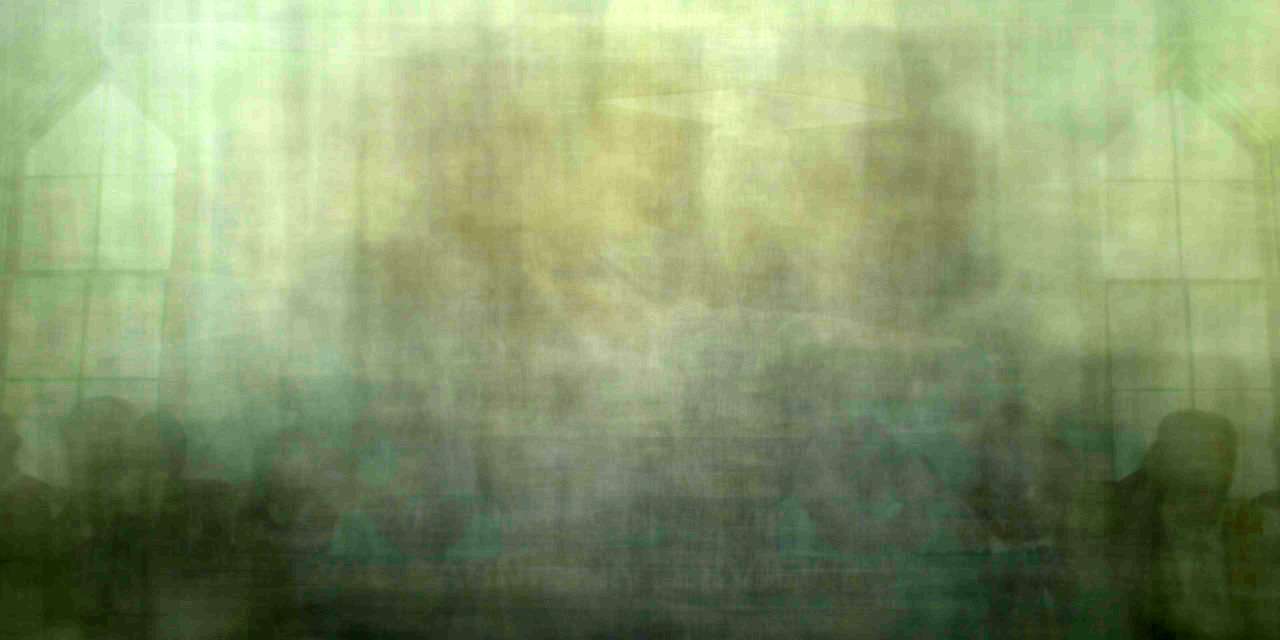
Fig 3. House of Cards, episode three, season one in one image (compiled at a rate of one frame per second – approximately 3,300 frames in total)
Decreasing the sample size further still – from one frame per second to one frame per minute (approximately 55 frames in total) – produces a much cleaner image but one that is less representative of an entire episode. Nevertheless, these 1fpm composites (see fig. 4 below) still give us a sense of the overall colour palette and composition, with the added advantage of some more recognisable details in the final picture (e.g. venetian blinds, architecture, outlines of figures, etc.)

Fig 4. The House of Cards pilot episode in one image (compiled at the slower rate of one frame per minute – 55 frames in total)
The very different results generated for individual episodes suggests that composites could be a useful mode of “deformative criticism”, giving us a kind of X-ray of an episode that reveals a significant deal about composition and colour palette, amongst other things. Indeed, if we compare the composites of the pilot (figure 2) and the third episode (figure 3) we can instantly see that the latter features fewer cuts and/or camera movements. Thus, we also learn a great deal about the pace and dynamics of an episode through these composite images.
BARCODES
The composites produced interesting results and, by their very design, condense a lot of information into one picture. However, I was curious as to how else we might represent an entire episode (or perhaps even an entire season) in one image. At this point, I discovered the phenomenon of Movie Barcodes. Essentially this method uses an algorithm to compress each frame (or a sample of frames) of a video and stack them side by side. Using a slightly modified version of this python script (and the same two open source packages used for the composite technique), I produced a number of TV barcodes or, as I prefer to call them, “DNA profiles” for various television episodes.

Fig 5. The “DNA profile” of the House of Cards pilot episode.
For me, these DNA profiles are equally if not more insightful than the composite images above. Immediately you get a sense of the variance in colour over time (rather than the average colour produced by a single composite image). We can also see the overall narrative progression (from day to night, light to dark, etc.), the frequency of shots and changes in scenes, and so forth. Best of all, it only takes around 20 seconds to compile one of these images (hence the title of this post). Thus, it took me less than four and a half minutes to distil the entire first season of House of Cards into the following image:
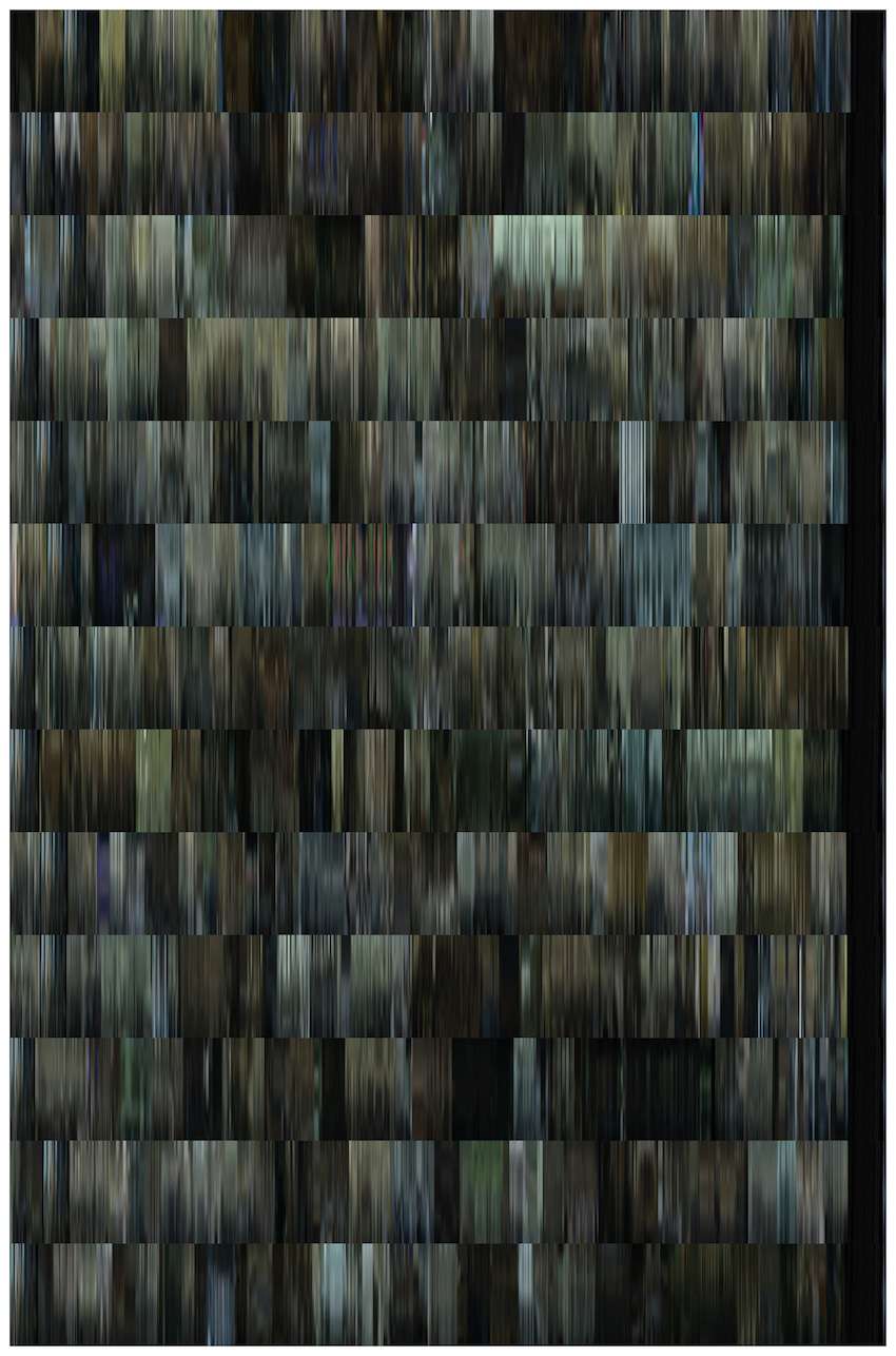
Fig 6. DNA profile for season one of House of Cards, episodes 1-13. Note the church scene in episode 3 which we could see in the earlier composite image. Also note the dark area creeping up from the bottom right of the image, covering the final 3-4 episodes, suggesting that the cinematography becomes darker as the series progresses.
But why stop there? Why not apply this method to all seasons of a television series in order to search for patterns on a much larger scale, a la “cultural analytics” (Manovich, 2009)? Or why not compare different series side-by-side as in the following image:
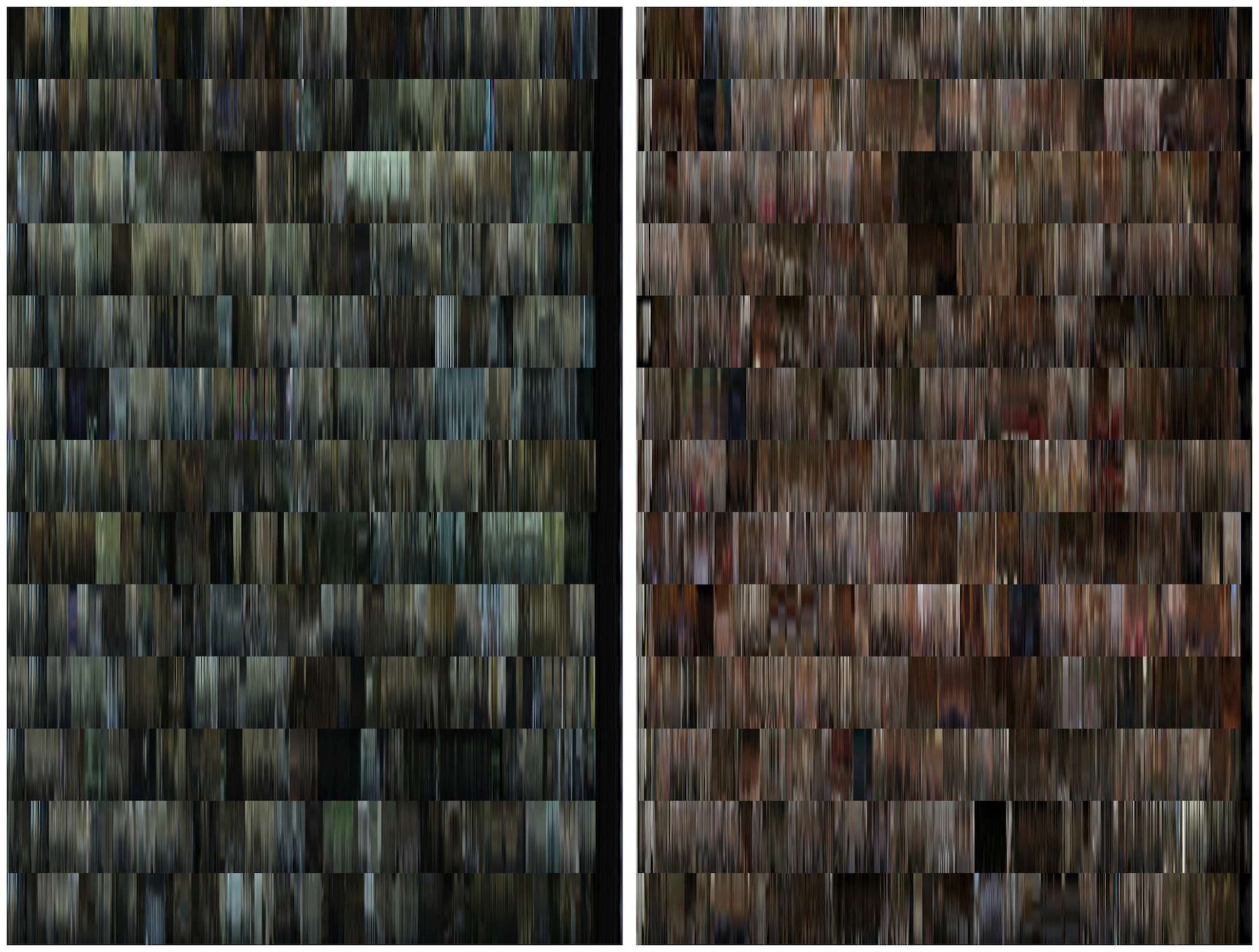
Fig 7. Left: DNA profile of season 1 of House of Cards. Each of the thirteen rows represents one episode. Right: DNA profile of season 1 of Mad Men
FINAL THOUGHTS AND FUTURE USES
Though these are only some initial experiments, they do seem to fulfil Mittell’s definition of deformative criticism in that they not only ‘make the original work strange in some unexpected way’ (2016) but that they also reveal the structure of these texts and offer various other insights. As Mittell (2016) observed following his own experiments with videographic deformative criticism, the possibilities of this type of algorithmic driven approach are almost infinite. For instance, in addition to the X-rays and DNA profiles described above, we can also take the “pulse” of audio visual content by introducing a shot detection algorithm into the workflow. This allows us to identify and extract all keyframes (i.e. the first frame of each new shot) of a video file. We can then use this information to instantly calculate the average shot length (ASL) of any video content (number of extracted keyframes ÷ the runtime of the content = ASL) [2]. We can even extract the timecodes of these keyframes and use this data to plot and visualise the overall pulse of a television episode (see fig. 8) (perhaps more on this in my next CST post). Through these kinds of algorithmic approaches, who knows what other kinds of medical tests we might be able to perform on our favourite television programmes, or what the results may tell us.
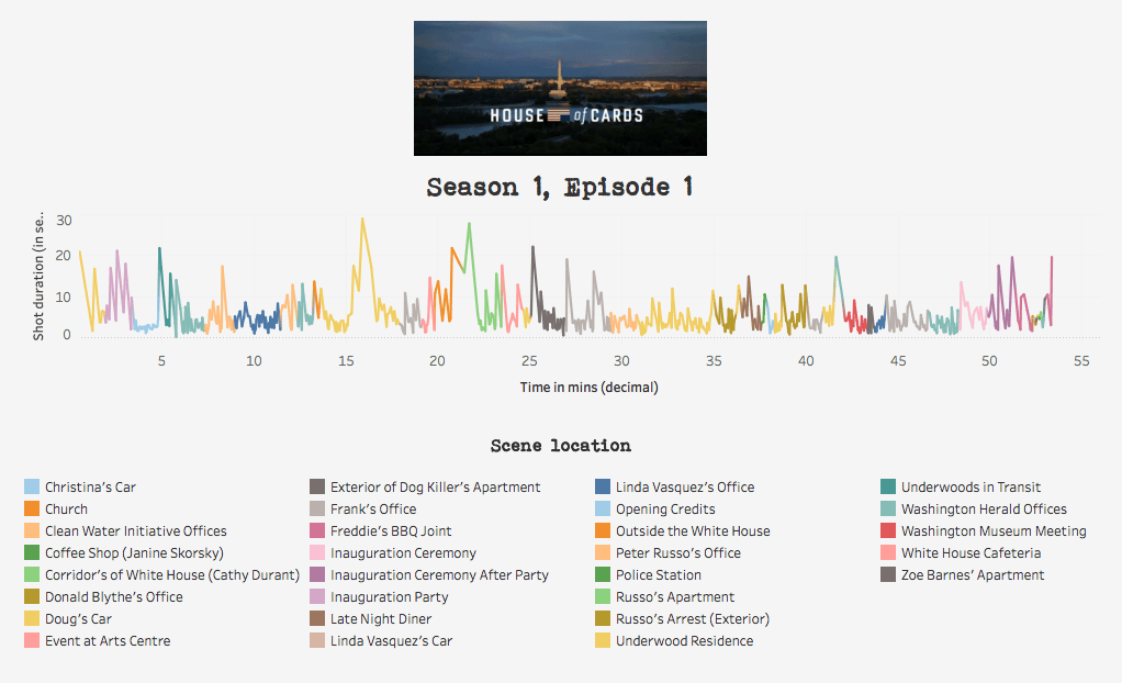
Fig 8. The pilot episode of House of Cards, reverse engineered and visualised as a pulse. This is just one example of how the narrative might be visualised. In this instance the y axis represents the duration of a shot (in seconds), whilst the x axis represents the duration of the episode (in minutes). The spikes thus refer to long shots. Incidentally, the longest shots tend to be those that feature monologues by Frank Underwood.
WORKS CITED:
Manovich, Lev (2009) ‘Cultural Analytics: Visualizing Cultural Patterns in the Era of “More Media”’, Domus (Spring).
Mittell, Jason (2016) ‘Videographic deformations: PechaKuchas’, Just TV, Jan 12. [Available at: https://justtv.wordpress.com/2016/01/12/videographic-deformations-pechakuchas/]
Shulman, Jason (2017) ‘Final cut: films condensed into a single frame – in pictures’, The Guardian, May 16. [Available at: https://www.theguardian.com/artanddesign/gallery/2017/may/16/jason-shulman-films-condensed-into-a-single-photo-frame-in-pictures]
JP Kelly is a lecturer in film and television at Royal Holloway, University of London. He has published essays in various books and journals including Ephemeral Media (BFI, 2011), Time in Television Narrative (Mississippi University Press, 2012) and Convergence. His current research explores a number of interrelated issues including narrative form in television, issues around digital memory and digital preservation, and the relationship between TV and “big data”. His forthcoming book, Time, Technology and Narrative Form in Contemporary US Television Drama (Palgrave) is due out in late 2017.
NOTES:
[1] The first piece of code uses ffmpeg to extract a user-specified number of frames from a video file (ffmpeg -i myvideo.avi -vf fps=1/60 img%03d.jpg) whilst the second piece of code uses imagemagick to combine these frames into a single image (convert img1.jpg img2.jpg … imgN.jpg –average result.jpg).
[2] In case you were wondering, the pilot of House of Cards has an ASL of 4.28 seconds, excluding the closing credits and the three establishing shots.

Fascinating!